Friday, 24 April 2015
Thursday, 23 April 2015
Tuesday, 21 April 2015
Monday, 30 March 2015
Friday, 20 March 2015
Editing my ancillary texts
 |
| This is a screen grab from one of my filming shots. I am going to crop this image into a square and use it as one of the images for my ancillary texts on the CD. |
 |
| This image is after I have cropped it so that it fits the format and shape of a CD album cover. |
 |
| In this image I have edited the image to be black and white to match the theme of my CD cover and poster |
Wednesday, 18 March 2015
Re-finised
Monday, 16 March 2015
Editing my poster
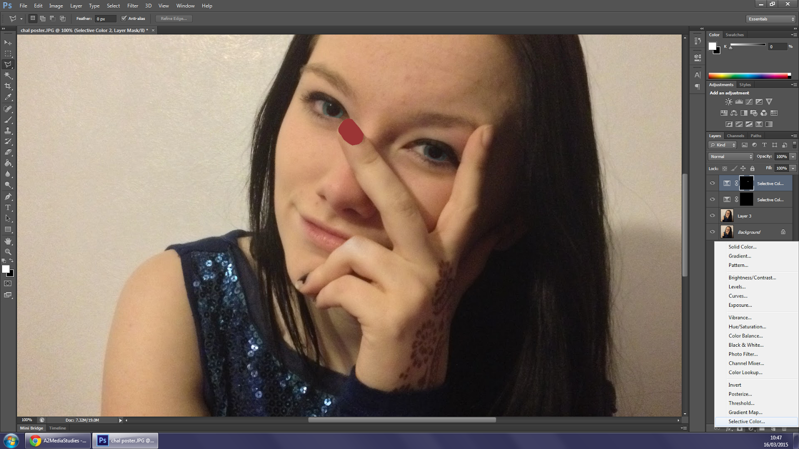
On this image I have edited Charlie's eyes so that they are a very blue colour. this makes them stand out more on the image, I intend to make the poster black and white much like my CD to carry on the theme, again making the eyes stand out. (there has also been a finger nail edited but has still yet to be finished, and the other ones need 'painting' too).
 |
| On this image I have edited the nails on her hand so that they are all the same colour, I have also edited the lighting so that the picture is much brighter |
Friday, 13 March 2015
CD progress
the fonts that are featured on the front of this cover need to be switched around as it was alerted to me that the name of the album is usually bigger than the artist name. I also need to continue to change all of the nails on her hand to red to match the colour scheme of black white and red as they are seen as quite 'punky' colours.
Wednesday, 11 March 2015
Tuesday, 10 March 2015
Ancilary text pictures
 |
| Wrong kind of flash was on |
 |
| Practice shot to make sure I had the right settings |
 |
| charlie moved her arms |
 |
| good but would need a lot of editing to erase the background |
 |
| Editing needed |
 |
| good |
 |
| moved her arm |
 |
| good |
 |
| need a lot of editing |
 |
| needs lighting editing |
 |
| a bit blurry |
 |
| started talking |
 |
| good |
 |
| good |
 |
| cant see a lot of her face |
 |
| good |
 |
| a but blurry |
 |
| good, nails need editing |
 |
| blurry |
 |
| good, nails need editing |
 |
| good |
 |
| good, editing |
 |
| good |
 |
| blinked |
 |
| good |
 |
| good |
 |
| a lot of her head is cut off |
 |
| good |
 |
| good |
 |
| good |
 |
| good |
 |
| good, editing |
 |
| bit blurry |
 |
| Add caption |
 |
| too much of her head is cut off |
 |
| blurry |
Subscribe to:
Comments (Atom)


